Raquel was mindlessly browsing Instagram on her Pixel 3. Her thumb repeating the same gesture over and over again – until she found an image that intrigued her and then tapped the hashtag #octoberfest in the comments. Three polka videos and 15 images of lederhosen later she typed in “octoberfest in sf” and found a pic of her friend drinking out of a 2-liter glass boot.
Does Raquel’s Instagram browsing experience remind you of how you navigate your favorite app? There’s a reason for that. As Principal Product Manager for Eventbrite’s mobile app my team and I mapped out the primary navigation gestures used to discover events on mobile, and created a remarkable event app. Read on to learn how we did it.
It all starts with data
At Eventbrite, we have two sides to our marketplace-based business: the business (organizer) side and the consumer (attendee) side. With 3 million events published in 2017, there is a huge user experience problem with trying to show an increasing amount of events onto your mobile screen – all at the same time. So my team and set out to improve the event discovery experience, which started with our home screen – a simple feed of upcoming events.
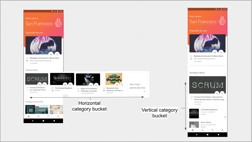
Our initial approach to the feed was to create a list of horizontal category buckets of events but limit that list to the number of categories, creating a “bottom” to the list view. However, with the task being to improve event discovery my team asked, “why limit consumer’s vertical experience subjectively?” So we ran an A/B test of the initial horizontal bucket feed against a (now) more traditional vertical feed with infinite scroll –so the user would never hit the “bottom.” To maintain as much of a control as possible, we kept the backend response to the client the same so that we would be able to understand the impact to engagement and retention in our analytics tracking throughout the month-long test.

The analysis showed a clear winner:
Event Clicks saw an increase of 3+% for the test group (B) compared to the control (A), as well as a 3% lift in users selecting/tapping “Get Tickets”. This lift was mainly due to the exposure of the “See More Events Like This” suggested search jump off. The “See More” search saw an increase of 57% during the test, suggesting that prompting the user to search after exposing them to different topics may help users further consider events under suggested topics.
As the team paired this A/B test with qualitative user research a funny thing happened – we mapped out the event discovery funnel and the key gestures and influences that interact to make consumers attend an event.
Attendance Probability
One reason we were so intrigued with understanding how users used different navigation gestures in the funnel was due to our internal research that referred to the event discovery experience as “a serendipitous moment.” This was understandable as the focus of that research was to identify the decision-making process of attending an event once it has moved into the consideration state, but my team and I found the analysis extremely vague in regards to the discovery rituals.

With a need to understand how people physically wanted to explore events the team first needed to understand the consideration process for attending the event. Luckily I was able to pair our search patterns with the output of the qualitative research to create three core influences that impact event purchase consideration:
- Availability (time & location of the event)
- Inventory (the main act or headliner, the type of event)
- Attributes (friend’s availability, the venue, dress code, weather on event day, transportation logistics, price, etc.)
Understanding these three core influences is necessary to power the backend response and put the app in a position to show a high-possible conversion event. While seemingly straightforward, the three influences are relational to each other in that if one of the influences is problematic (in regards to attendance), then the others can overcome the adverse effect of it. To illustrate the above let’s run through some examples:
Example #1: Friday night show at The Independent (San Francisco music venue)
Let’s assume that we are showing recommendations at noon on Friday, and there is an event that evening which starts at 9 pm. If I work or live near The Independent, it’s a lot easier to attend the event vs. if I worked on the edge of the city and commuted to San Jose. Still, even if I’m physically close to the location, I’m not set on attending until I validate who is performing (inventory) and then which of my friends can go (attributes).
Example #2: Burningman
Let’s assume I’m living in Europe, but it’s October (i.e., the next Burningman is 10 months in the future). Although the event is physically far-away, the fact that it’s also far-out in time is helpful (complementing location). The event itself is the draw (inventory), but the level of commitment needed to travel to Burningman means that I need lots of good friends going to make it happen (attributes).
While it’s apparent how each influence impacts the other two, what’s more interesting is that the combination of the influences for each event produces a different outcome in regards to a person’s probability to attend it.
As the team’s understanding of attendance probability became grounded in our qualitative research results, we began to re-look at the initial data from the A/B test. With an experienced perspective what the team and I now found more interesting was the consumer’s transition from swiping in the vertical browse experience to tapping in the suggested search experience, rather than the actual metrics themselves. We wondered if the transition between the two mobile gestures (swiping and tapping) was fluid (back-and-forth) or if it was funnel-based (goes one-way) and if these gestures correlate with intent to attend an event.
Just Gestures?
When we talk about navigating or exploring on an app, what we’re doing is using our fingers to steer the app to the response we want. Qualitative assessments showed that the Home Feed (with its vertical-infinite scroll) was highly used with a swiping gesture. As users would find events or canned searches that interested them, they would move to a tapping gesture to dive deeper. Moreover, once a user wanted to find a specific event they would leverage the keyword input for search and begin typing. Interacting with push notifications complemented this discovery experience. Top-level user interactions with push notifications also complemented this discovery experience.
Mapping these interactions to the level of involvement from the user results in a clear arc of effort to interaction:
- Notifying: the user receives a push notification and is notified of an upcoming event. This is the least amount of effort a user can provide since it is virtually none and corresponds with zero intent.
- Swiping: the user has opened the app and is browsing through the feed with one finger. This browse experience is a simple repetitive action that the user can do even if they are bored and looking for something to do (an everyday use case) and corresponds with a low level of intent.
- Tapping: the user’s consideration has been triggered and is now partaking in a tapping action. It could be from a `see more events like this` link or a suggestion in another screen – but the suggestion is congruent enough with their consideration set that it results in the user tapping it, displaying a medium level of intent.
- Typing: the user either knows what he/she wants or has a perfect sense of trying to steer the app towards their consideration criteria. They take out their second hand and enable the keyboard with the maximum amount of physical effort that can with the highest level of intent.
These four gestures map back to the physical patterns expressed during the serendipitous event discovery moments – without all four any product is missing a fundamental discovery use case needed to be successful.
What does this mean for me?
If you’re a Product Manager or UX-specialist, it’s easy to take on a project and carve out an MVP that doesn’t include all of the elements laid out in this post since your users can do the core task. However, once you look to improve upon that initial output make sure to design the navigation elements of your user experience to correspond to the intent of the user – then pair with qualitative research to understand the variables in decision making for users and how they compliment each other.
What’s next?
We’re trying to push the limit of how can we apply the four navigation gestures (notifying, swiping, tapping and typing) into the mobile experiences at Eventbrite. If you have our iOS or Android apps, don’t be surprised if you get enrolled in an A/B test and are exposed to unique ways to explore more events! Also, if you don’t have our app now’s a great time to check it out: Android or iOS available.
So what do you think? Feel free to post your thoughts in the comments below and make sure to pass this article along to any Product Managers or UX-specialists you know. Also feel free to read about my efforts to create the best ticket scanning experience for our fans.


Hi Matthew, Thank you for share this great information this us. i will follow your helpful tips & i will share it. your this blog is very help for me & us. i like it. can you share more information about mobile.