
Finally, we arrive at part 3 of our three part series covering six unsuspecting problems in HTML, CSS, and JavaScript, and their solutions. In the previous part of this series we covered two concepts that will help make a noticeable performance improvement in your application: DOM reflow and event delegation. In this final part of the series we will cover two common scenarios involving layouts: horizontally and vertically centering a DOM element, and creating a table with a fixed header.
Horizontally & Vertically Centering an Element
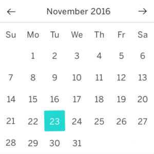
You’d think this would be a straightforward task, but surprisingly this is not as simple as the name implies. Vertical alignment in particular is tricky because CSS’s vertical-align style only works for table-cells and inline-block elements. I ran across this problem when designing the DatePicker used in the Eventbrite Design System (EDS). The DatePicker is a calendar where each row is a week, and each day in the week is the shape of a square. The numbers representing that day of the week needed to be vertically and horizontally centered.
There are many ways to center elements, and all come with their drawbacks. To choose the correct combination depends on the use case.
Solutions
- Add equal padding to the top, right, bottom, left sides of an element.
- Horizontal: Place a wrapper div around a group of children and set the text alignment value of that parent div to center. Child elements must either be inline or inline-block elements with a set width.
Vertical: Set the parent wrapper’s display value to inline-block, its vertical-align value to middle, and its height. - Horizontal: Have a wrapper div. Explicitly the child element’s width, then set the margin property of that element where its top and bottom margins are 0 and the left and right margins is set to auto (margin: 0px auto).
Vertical: Set the parent wrapper’s display value to inline-block, its vertical-align value to middle, and its height. - Vertical: Nest three divs, and set the two outer div class names to table, cell respectively. In CSS, you will set the styles of each of these class names to display: table and display: table-cell, respectively. Table cell elements have access to the vertical-align property, so add vertical-align: middle to the parent whose display value is set to table.
Horizontal: For the third nested div, give it a fixed width, and set its margin to margin: 0px auto. - Horizontal: Given a div, set its dimensions to an equal width and height. Set its text alignment to center if it’s the child is text-only. If the child is another div then you can fix its width and give it a margin of margin: 0px auto.
Vertical: Set the line-height value to equal the height of the div. - Use Flex boxes.
For EDS’s DatePicker, I used solution #5. This will be backwards-compatible with most old browsers. Now that we are mainly offering support for modern browsers, it’s a safe bet just to use CSS3 flex boxes, which was made to avoid hacking solutions for layout quirks presented in CSS.
Reference
Fixed Table Header w/ Scrollable Body
Here is one last tip to out maneuver those pesky browser quirks that make you think, “Why wasn’t this functionality added in the first place?” If given the task of creating a table that will eventually be populated with data that spans more than the height of your browser window or at least the height of some design requirement, it would be nice to be still able to see the column headers as you scroll down the long table of data. One would think this would be trivial.
My goal was to create a table with a fixed header and scrollable content where the table could be positioned anywhere on the page, and no JavaScript involved. A live demo can be found on the JSFiddle link, and the source code is available on both JSFiddle and Github.
There are multiple solutions to achieving the desired effect, and each having their drawbacks. I will explain the approach I took. Ironically, to have a fixed header, I never used the CSS position: fixed style. In most cases, position: fixed is the go-to solution for giving elements fixed positioning in the user’s window. Unfortunately for our use-case, it breaks child elements from the flow of their containing parent making its positioning relative to the window rather than the parent. This would be a problem if I wanted to move the entire table as a group.
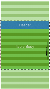
The secret to this technique is to use two separate tables instead of one. The header row that contains the title of each column is one table, and the actual body of data is another table. Since we want the final table to be grouped together allowing it to be moved
across the page as one unit, I wrapped both tables in a div (black dotted line).
Now, to the main task of fixing the header to the top of the wrapper div. I could not set the header table to position: fixed because it would cause the header to break from being contained by the wrapper div as explained earlier.
I needed the header table to be at the top of the page, and the body content to flow past it without the header it self moving. This can be done with position: absolute. Set the header to position: absolute causing it to align itself at the top of its parent container. I needed to set the wrapper div’s positioning to position: relative in order to force its absolutely positioned child’s left and top margins to 0 align relative to the parent div and not the browser window. Absolutely positioned elements are no longer apart of the natural flow of the pages layout or its containing box; therefore, not matter how it’s sibling or other elements on the page move it will not move. Viola! We now have a fixed table header.
Now, that the hard part is out of the way, we need to make the data in the table body scrollable. In order to make scrollable content in HTML, we can make use of the overflow: scroll style. For the data body, I created a second table element. I wrapped the second table inside a wrapper div (red solid line). In order for the overflow: scroll style to activate, I needed to set a fixed height on the body wrapper div. Whenever it’s child (data table) overflows it, the scroll bar will appear.
Now, we need to properly vertically align the data table with the header. Since the header is absolutely positioned, the top part of the data table will render beneath the header. It would be best to set a fixed height on the header, and place a margin-top styling on the data table equal to the height of the header. This will vertically align the top of the data table just below the header revealing all of the data rows that were once covered.
The last major problem that needs to be addressed it ensuring the width of the header columns equally align with the width of the columns in the data table. The header table should have the exact same number of columns as the data table, and each corresponding column between the two tables should have the same width.
This is the gist of everything. The rest is styling to the final product look appealing. Take a look at the source code linked below to see the full implementation, as well as the demo. Thanks for following along this tutorial series, and hopefully a few more tools were added to your tool belt.