
Your event website doesn’t magically sell tickets and registrations for your event. To be effective, your website needs to strategically guide attendees through their decision-making process.
“It’s important to know how each element on your event website communicates the event experience, helps the attendee decide it’s worth attending, and ultimately rationalizes their decision,” says Jason Bayly, Senior User Experience Architect at Eventbrite. “Only after they’ve bought into the idea of attending and rationalized their choice will they take the next step in the process, which is to purchase a ticket or register for your event.”
With that in mind, here are the essential elements to include in your event website — and how they can help you sell out your event.
The essential elements of an event website
1. Event name or logo
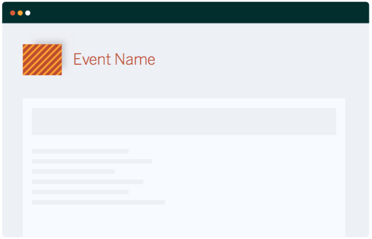
Web visitors arriving to your event website have been referred from somewhere, such as search engine results or a recommendation from a trusted friend or colleague. Your event name and logo will be the first indicator that they’re in the right place, so make sure it’s prominently placed on every page of your site.
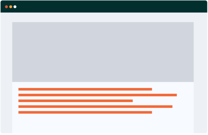
2. Header images
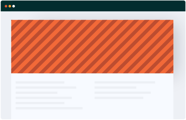
Header images are photos or graphics that are displayed prominently at the top of your page — and shouldn’t be taken lightly. These visual cues play an active role in the attendee’s decision process by giving them a glimpse into the event experience. You want your header images to capture the vibe of your event and portray it as a can’t-miss experience.
3. Location, date, and time
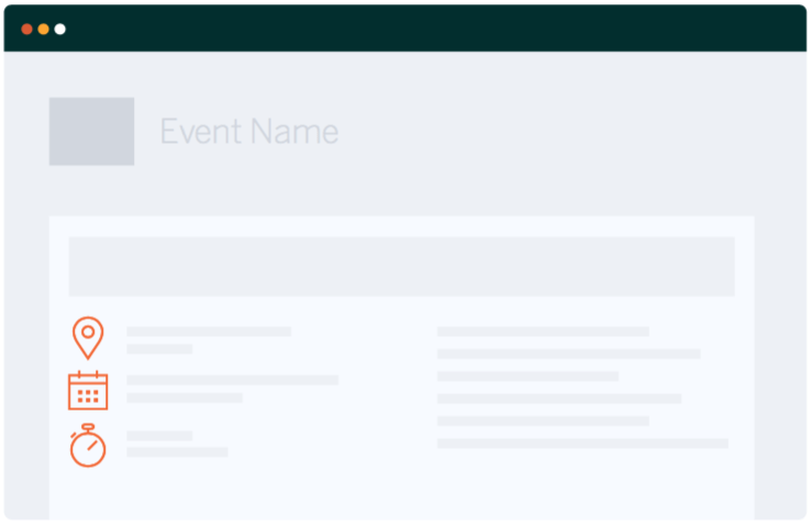
This information is arguably the most critical part of the attendee decision-making process. How can they attend if they don’t know when it is or where it will be? It may seem obvious, but this vital info can be easily overlooked. Whatever you do, don’t bury it. Make your event location, date, time, and any other critical information prominent on the page.
4. Call to action
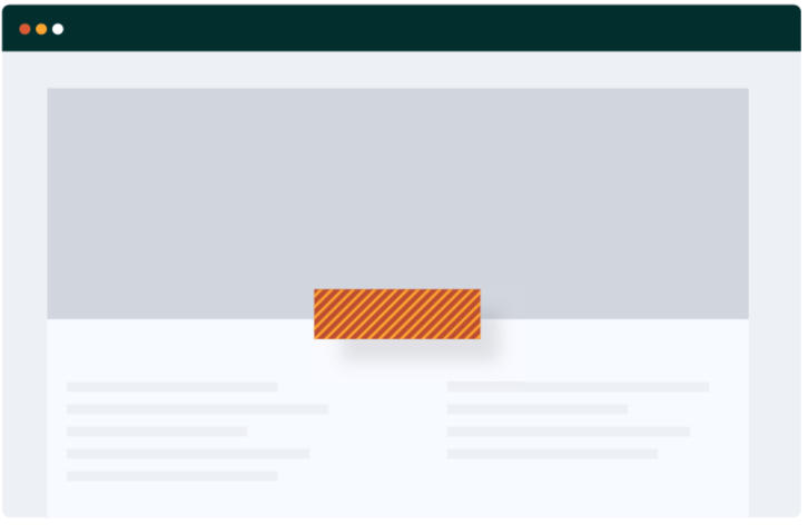
If your event website were a treasure map, your call to action is like the giant ‘X’ that points to the treasure. For most event websites, it’s the button that says “Buy Tickets” or “Register Now.” Make sure your map isn’t a maze. If a potential attendee can’t find your call to action easily, you risk losing their interest at a critical time.
5. Description
Your event description is text near the top of the page that gives your visitor a clear picture of what your event is all about. The more you can use your words to paint a picture of your event — and convey the benefits of attending — the better. For some tips to make sure your description packs a punch, check out The Ultimate Guide to Copywriting for Events.
6. Social Proof
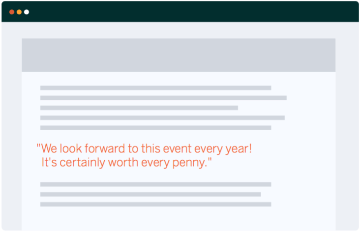
People observe how others act to inform their decisions. It’s human nature. A testimonial from an influential expert or a past attendee can go a long way to add credibility to your event. Studies show that 70% of consumers look at product reviews before making a purchase, and product reviews are 12x more trusted than product descriptions from manufacturers.
7. Ticket Purchase or Registration Form
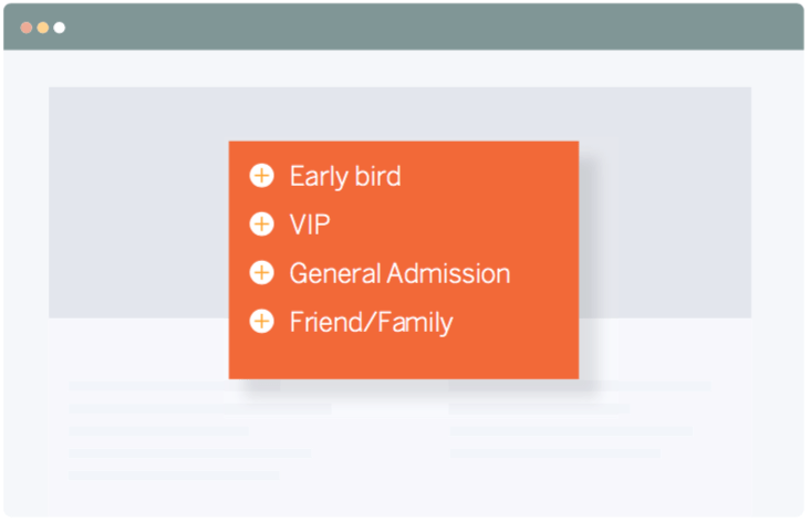
Last, but certainly not least, is your ticket purchase or registration form. Once someone has decided to buy, don’t let a frustrating purchase process make them second guess. Studies have shown that each step in the checkout or registration process will lead to a 10% reduction in transactions. Make your purchase process easy by reducing the amount of steps to checkout.
Although it’s an absolute necessity to give your event a web presence, your event website has to play an active role in your attendee’s decision-making process in order to succeed. You now know which elements to include in your event website and how they can help you sell out your event.
Check out our guide, Create an Event Website That Will Sell Out Any Event, to learn more building an effective event website.